McKesson Brands: Incontinence
Packaging Update, Product Photography, and User Testing

Before
PRODUCT
There was no easy way to tell products from each other because of all the products being solid blue. Printing was inconsistent with blue and textile pattern.
Random Changes
There was random changes in design with color, textile pattern, other colors used and where, size information and where it was located, and printing styles.
ABSORBENCY
The absorbency scale has no call out other than the industry standard name, that is not always colored on each product. There is also the tear drops, but the number of drops and what gets filled in is not consistent and makes no sense to customers.
OTHER
Customers feel brand looks cheap and old, is very hard to open and information is confusing. Customers feel briefs and underwear look the exact same and don’t know what the difference is.

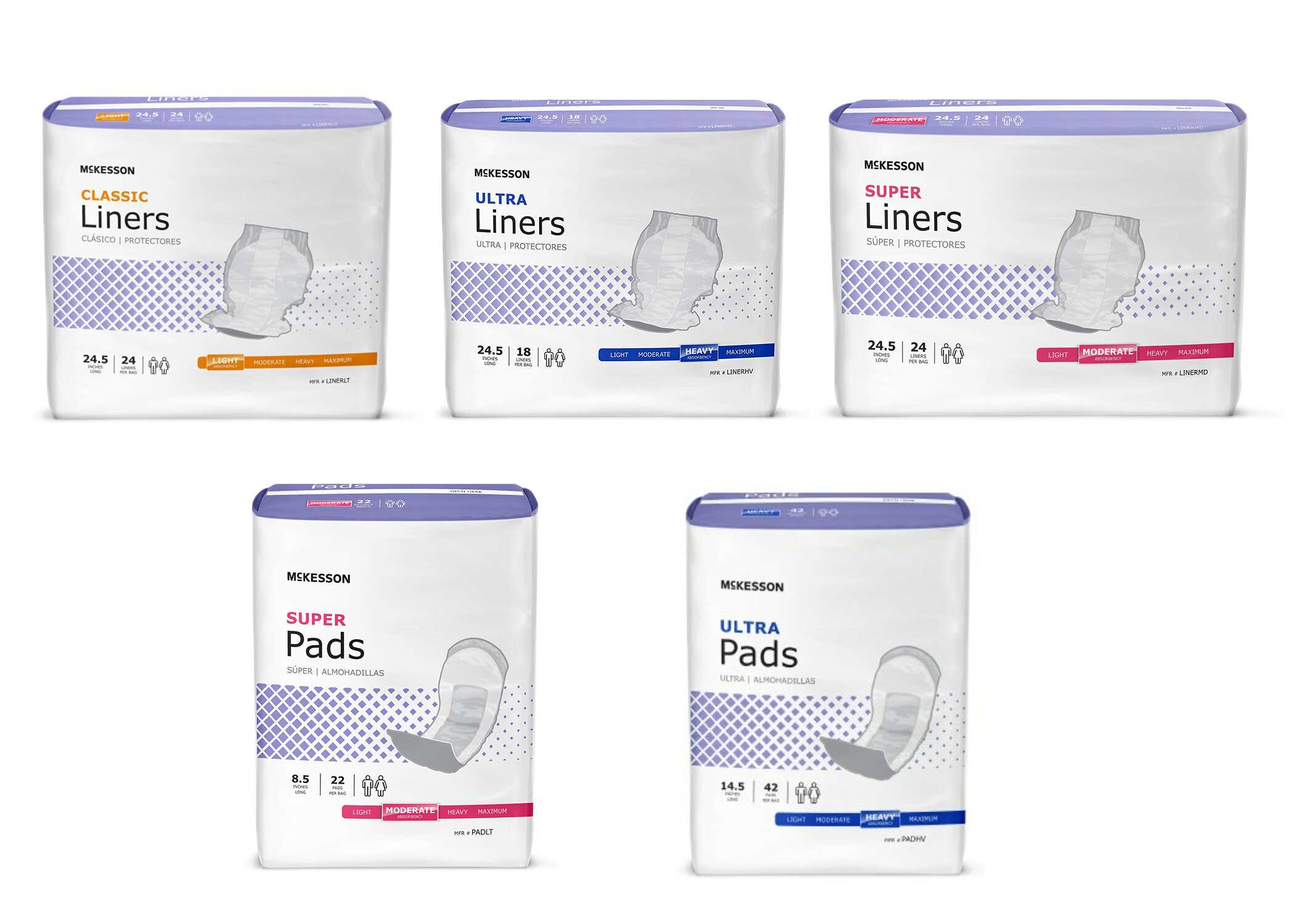
After
PRODUCT DISTINGUISHED
To make sure each product can be distinguished from a distance each product is assigned a color from McKesson’s extended care colors. That color is associated with the updated textile pattern and the sides. At a closer look the product image is like old design, but on a clean background, larger, and each product looks different. Used a new brief image to show the difference is that the briefs have tabs vrs a pull up like the underwear.
Size and Design Features
Size is located up in the left hand corner. Used only important information, size, count, unisex, and absorbency; that can be found in the same place no matter what product.
ABSORBENCY DISTINGUISHED
The absorbency scale color uses McKesson Brand’s original colors. No strange icons that don’t mean anything to the customer just an easy to read slide.
OTHER
Stays on brand with McKesson’s current brand standards along with consistent design elements to make everything feel more cohesive. Style guide was created for multiple sized packaging to avoid odd spaces and off textile pattern. Instructed for perforated tab with printer and added color to it to make it easier for customer to know where to open bag.
These products are primarily used in the extend care market. A large majority of care takers speak Spanish. So spanish was added to the packaging.