McKesson Brands: Baby Wipes
Packaging Update & Product Photography
Before
Both McKesson’s scented and unscented baby wipes were the same color and design. The old design found customers wasting time shuffling through the supply closet trying to find the right one, or worse grabbing the wrong one.
After
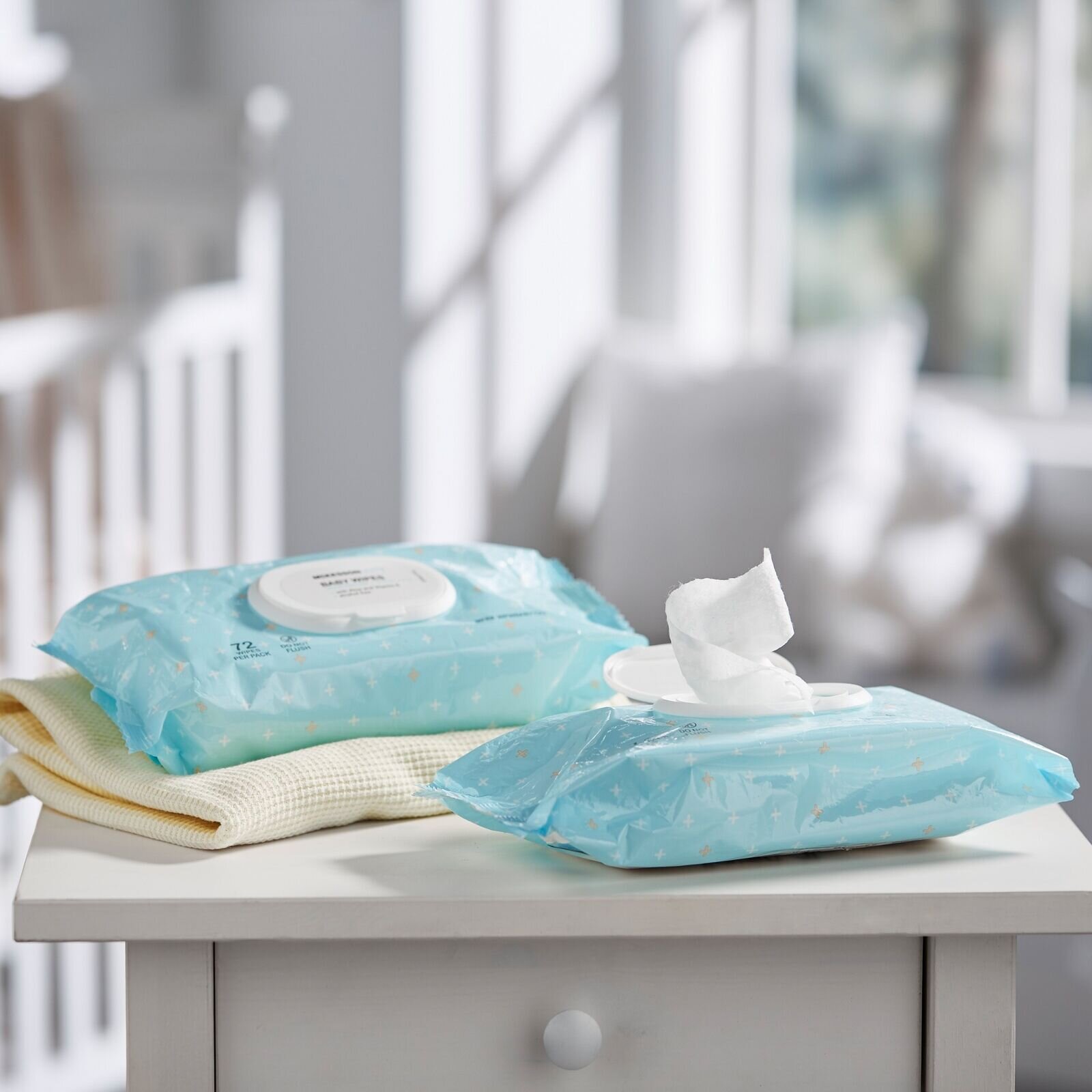
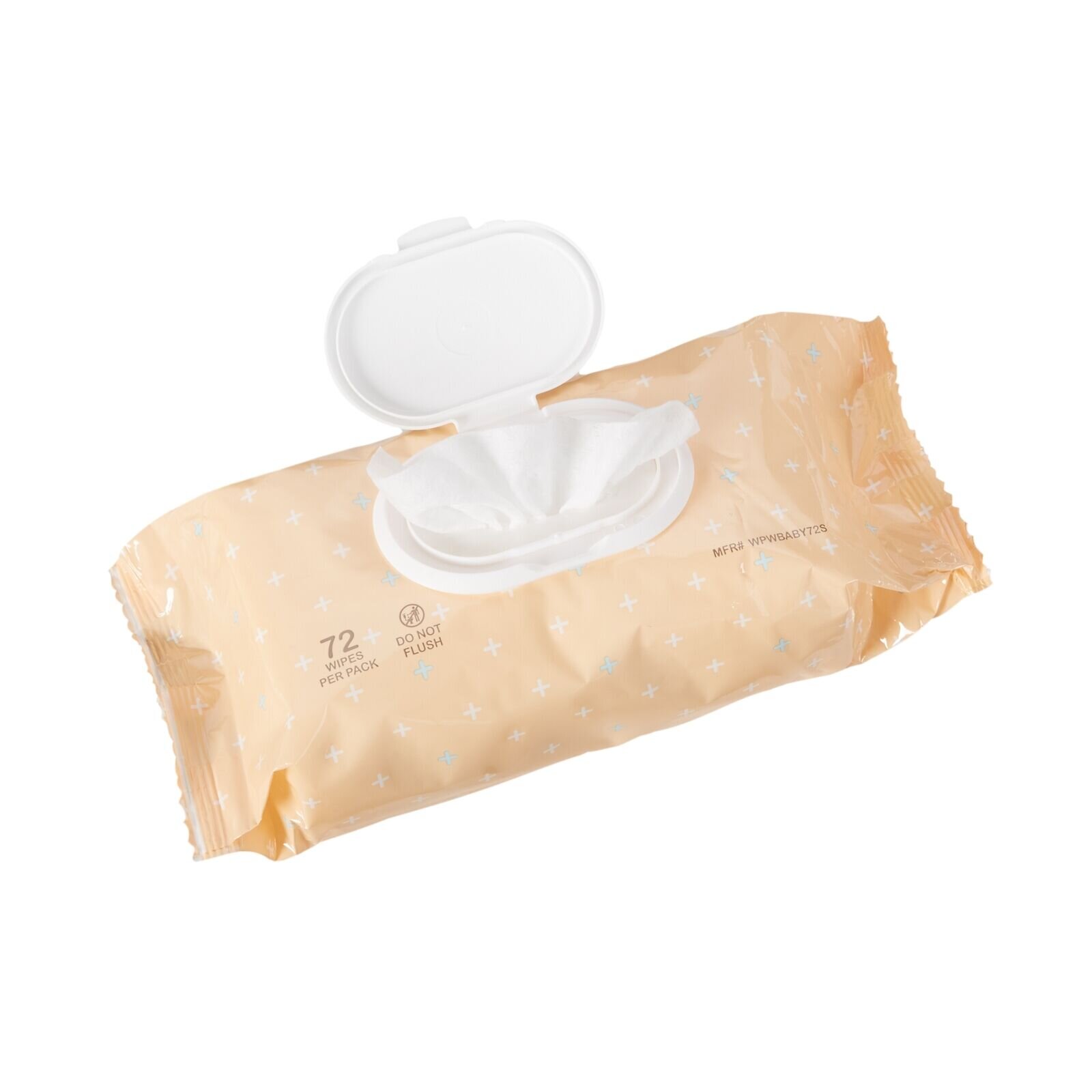
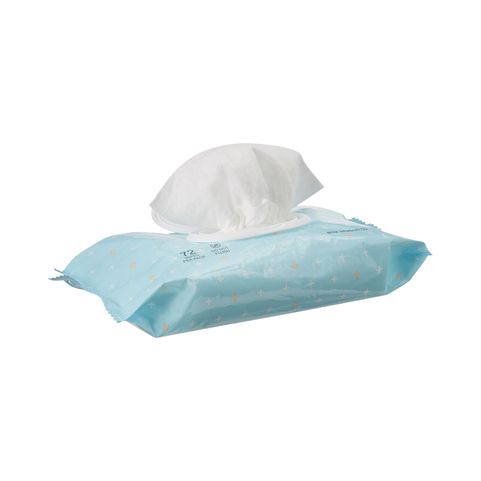
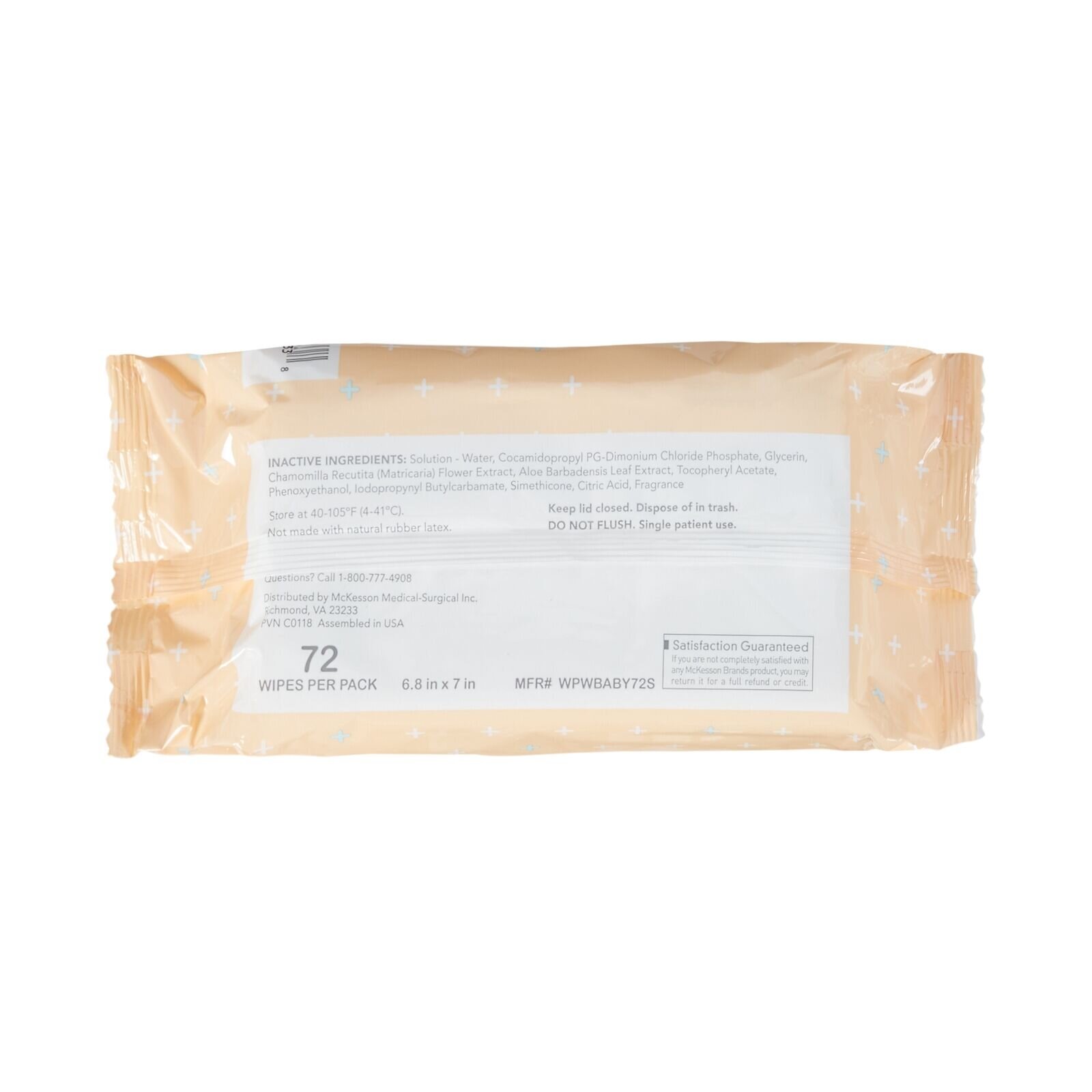
Rather than keep the teal we switched to McKesson’s blue and orange colors, but to keep on theme they were made baby blue and baby orange. With blue for unscented and orange for scented. It made it easy for the customers to grab the right product at just a glance.
The pattern was altered to be smaller and more delicate. As well as the crosses where rounded out to create a softer feel vrs the sharp edges.
Over all achieving a look that didn’t change too much from the customers perspective and became more helpful for the environment it is used in. A softer more baby like feel vrs harsh blocky look. All while staying on brand with McKesson.


